
Most feedback from the volunteer beta group I was working with was related to UI and UX. Listening to that feedback mattered. Deciding what to fix first mattered just as much.
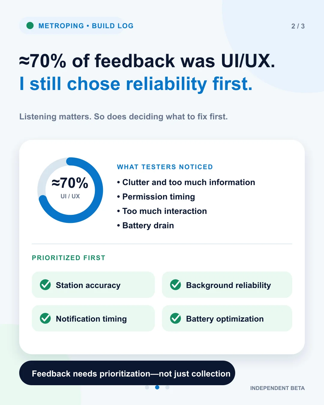
What testers noticed
The interface felt cluttered, too much information was visible, permissions appeared too early, and some screens asked for more interaction than a quiet journey app should.
Dark mode was needed, and some users also reported battery drain.
Why I chose reliability first
MetroPing's main purpose is to alert someone before a destination or interchange. A beautiful interface has little value if that alert arrives late, consumes too much battery, or stops when the phone is locked.
So station-detection accuracy, background reliability, notification timing, and battery optimisation became the first priorities.
Accuracy first did not mean design never
The app is gradually becoming simpler. Dark mode, clearer permission timing, less visible information, and quieter interaction all remain important.
The decision was about order: make the core promise dependable, then keep improving how clearly and comfortably the product delivers it.
Listening to feedback is only half the job.
The other half is deciding which feedback must be acted on first based on the product's core promise.
Try it on a real Delhi Metro journey.
MetroPing is not affiliated with DMRC. Use it as an additional reminder and share honest feedback about the experience.
Try MetroPing